
University course project
Objective
To re-design and conceptualize Horizon Railways' e-tickets as they shift from physical tickets to a digital experience, while maintaining legibility and user trust.
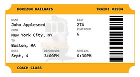
Original design
The original design's layout lacked visual interest and a strong brand presence impacting brand recognition and user trust. The typography is readable yet may be improved and modernized to appeal to their target market.
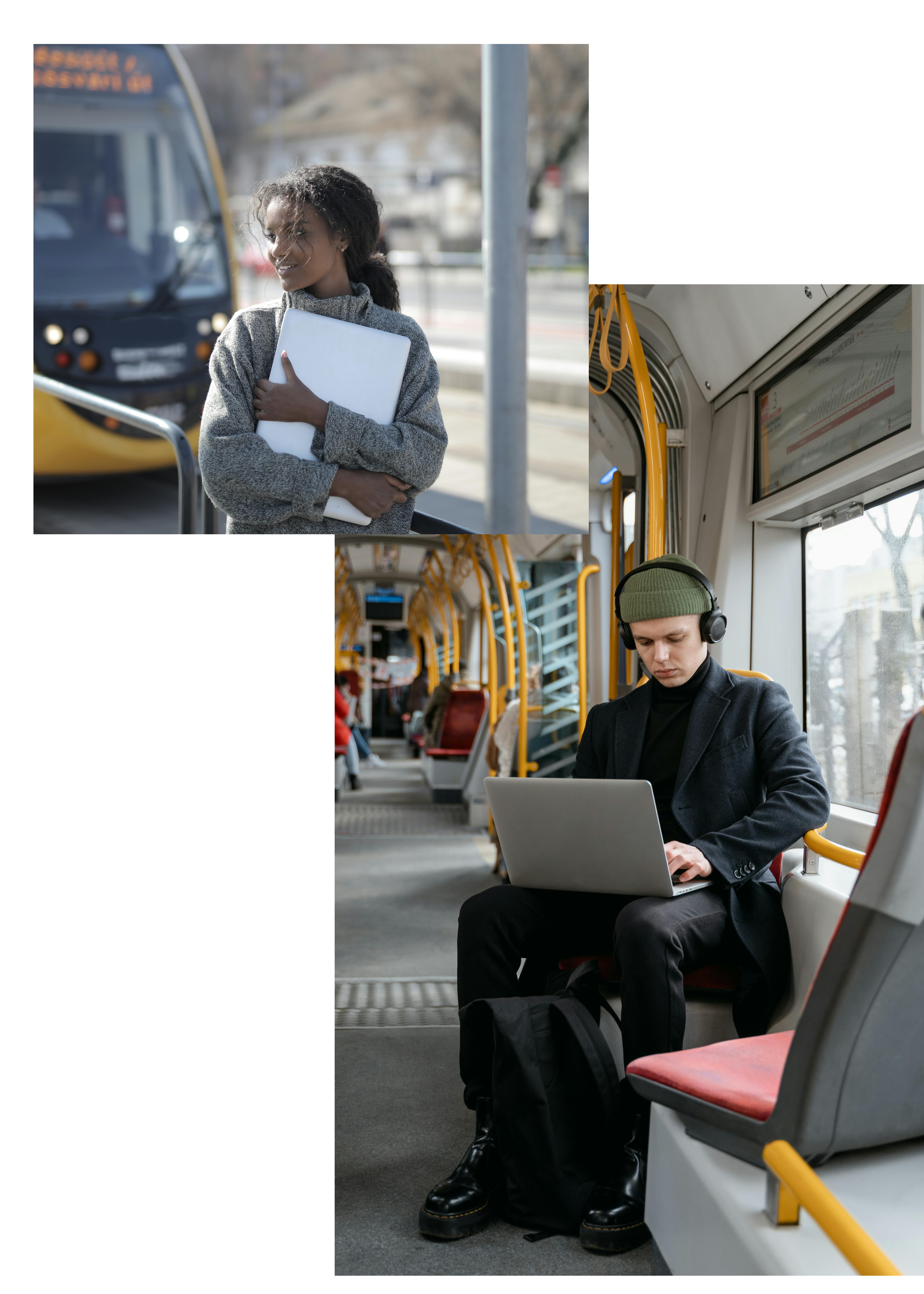
The users
The users are busy students and young professionals who value convenience, ease of use and the ability to make the most of their commute by working and studying onboard using WiFi.
Pain points
- Users struggle to find their seats easily
- Information is hard to scan quickly
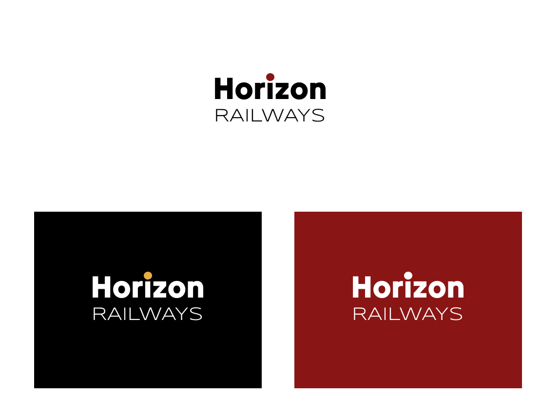
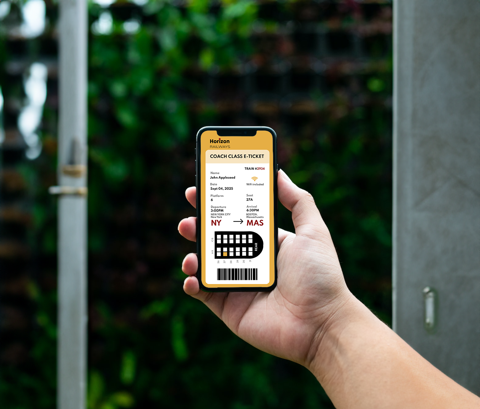
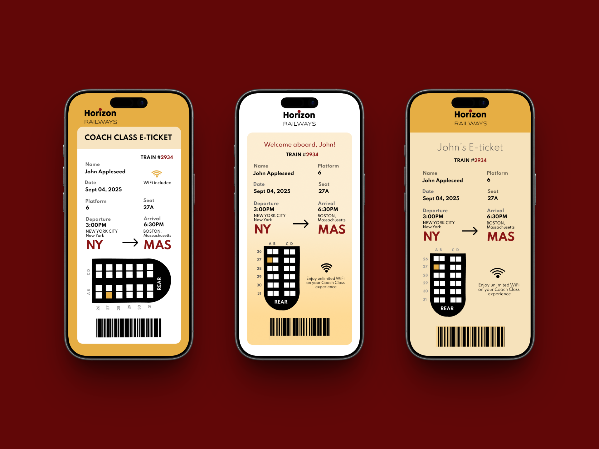
The re-design
Strengthened brand presence and user trust
A simple wordmark logo created a starting point for a brand presence. Its dominant colors are also used throughout the design to create consistency. This consistency creates credibility and strengthens the user's trust in the brand.
Modernized visuals
The typography is modernized as a minimal, geometric font is used in the re-design. The image with the train in the original tickets is also removed and simple shapes are used to create border, symbols and graphics for sleeker look overall.
Faster information scanning
The vertical layout shortens each line length and reduces eye travel from left to right. This makes scanning information from top-to-bottom faster for the user.
Addressed user needs for efficiency and connectivity
Including a seat map with users' individual seat highlighted and a WiFi symbol makes the amenities available to them and their seating information visible immediately. This reduces a sense of uncertainty and improves their experience overall.